Of all the Bay Area painters who took part in that seminal 1957 exhibition at the Oakland Museum, it is Richard Diebenkorn who has remained at the forefront of American painting history. Why is this?
Diebenkorn had one foot in both worlds. He had spent the previous years in Berkeley playing with abstraction in his landscapes and these geometries carried over into the work of 57. The figures are solid but the faces are not--he was not yet willing to go that far. There are no nudes on beaches. There is Matisse in these works especially in this one, Man and Woman in a Large Room, now at the Hirshhorn.
Here is an artist sketching and a woman standing by, and a similar sense of quiet confrontation between the pair as in the Bischoff image (yesterday's post), but a model with no face is clearly more of an object than a subject. There is an air of stillness as there would be between artist and model, but also, in the darker palette, an air of intensity. What will happen in the next moments after the sketching session is finished?
In the corner on the right, through the crack of a doorway, we see a slice of what was to eventually become the kind of brighter, flat, colorful landscape of the Ocean Park series for which he his so famous but the room itself is already broken down into the geometries that were to eventually take pride of place.
By 1963, Diebenkorn was back at the figureless landscapes in Berkeley which then gave way to the more sun drenched landscapes of southern California.
When I drive through Ocean Park today, I try to imagine him distilling this tract of land which is now bordered by so much commercial activity. But here in this interior, I feel only the pregnant moment of what was to come.
Will Rogers: a populist hero who transitioned from vaudeville to punditry
Will Rogers was a real cowboy, then a vaudeville star, then a national pundit with a radio show. He was a writer, a philanthropist and friend to world leaders. He had a terrific sense of humor and was self effacing. He said things like, " You can't say civilization don't advance ... in every war they kill you in a new way."
It's not always the case that stars who transition from show business end up on the right side of things as we well know. Always, he is my hero for having donated his land and homestead to the state of California thereby creating one of the most magnificent state parks. I want to pay homage to him today for being a lifeline to open lands during these restrictive times,to his spirit of good fellowship and for caring about the little guy.
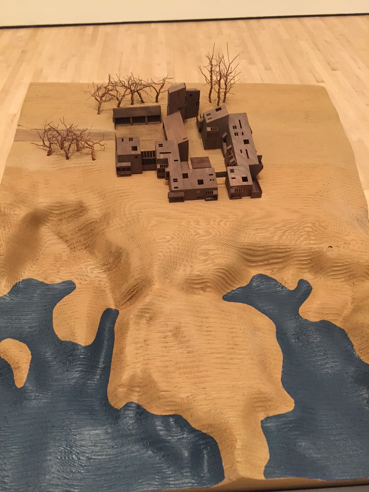
The Sea Ranch at SF MoMA: If you build it, will they come?
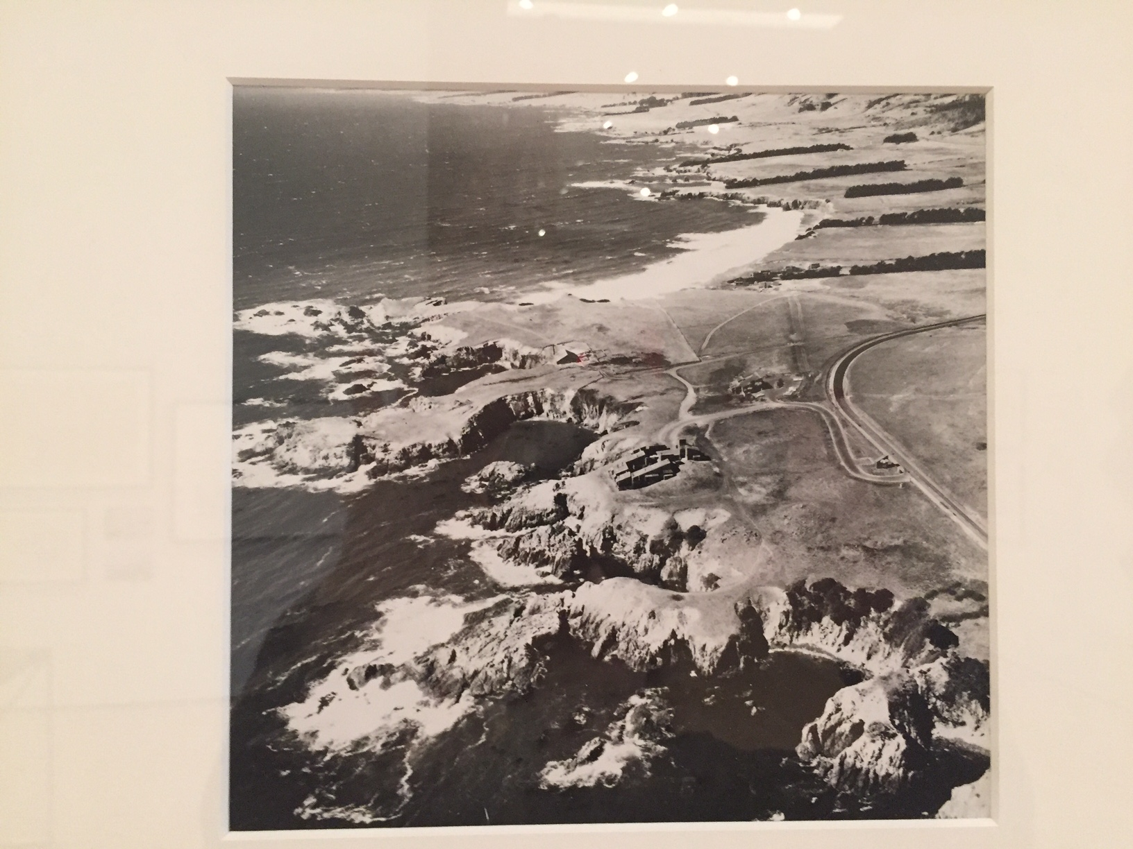
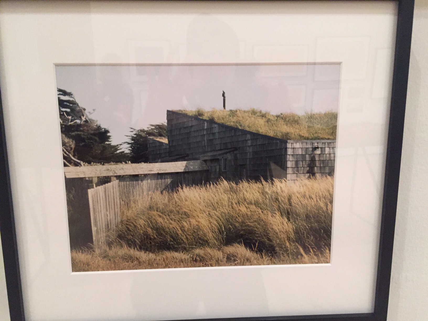
Sea Ranch, a sixties Utopian project by Bay Area architects and designers about 100 miles north of San Francisco, is now the subject of a tightly focussed exhibition at SF MoMA, and still exemplar of a remarkably sylvan development along ten miles of pristine California coastline.
The purchase of the land was organized by Al Boeke, an LA architect- developer in 1963 and was a hat trick that would never be allowed today as problems of public access to the ocean arose almost from the very outset. The powerful California Coastal Commission—which now regulates billionaires from getting their way in Malibu and other seaside communities— grew out of the divisive politics of getting the Sea Ranch underway.
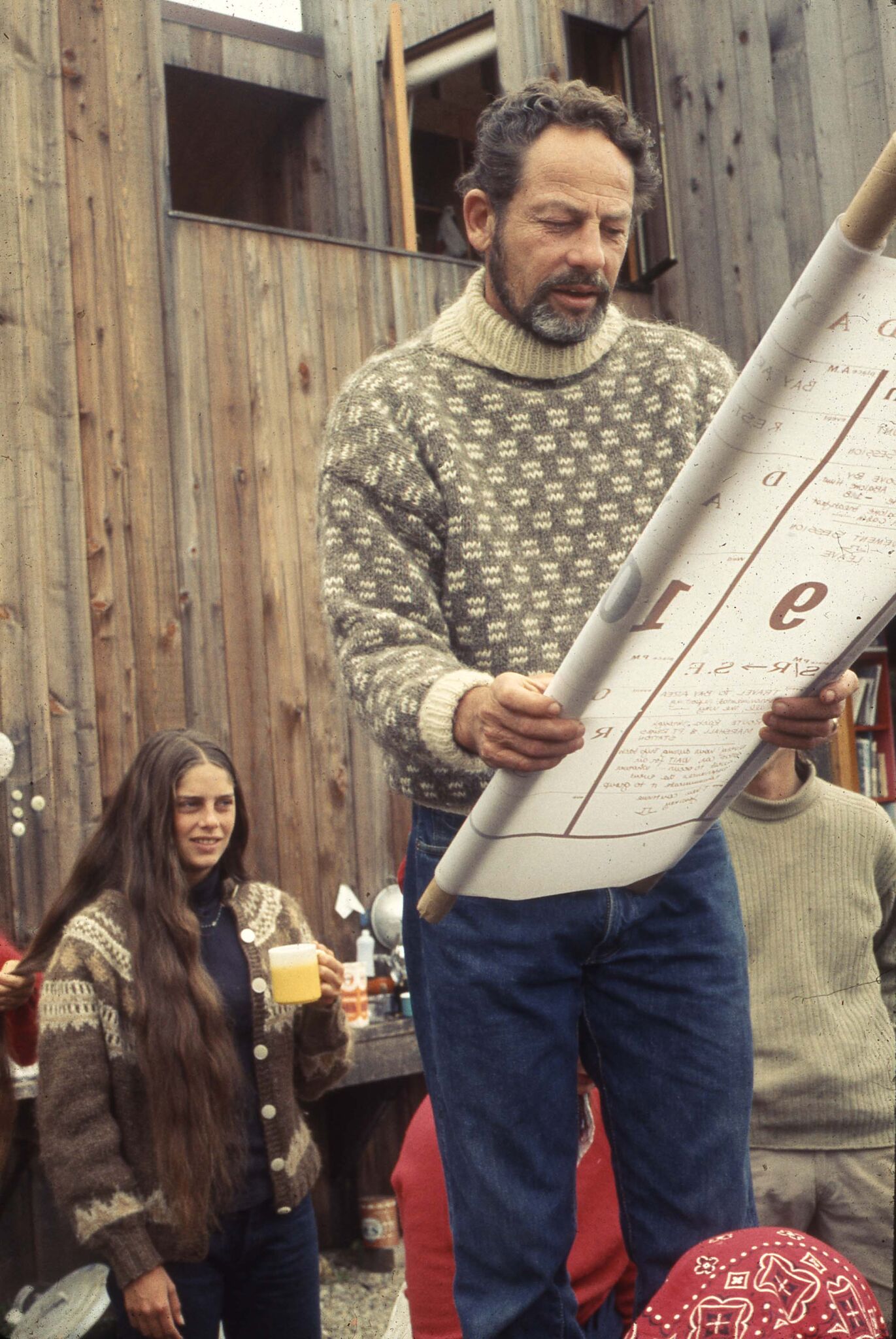
Larry Halprin, the opinionated landscape architect, was engaged to master plan the site and Joseph Esherick, Obie Bowman, Charles Moore, Bill Turnbull, and other architects and designers to create housing (the first condos) all out of unpainted redwood that would meld more naturally with the grassy, coastal landscape. Roofs had to have a specific slant. Bold graphic design and marketing by Barbara Solomon kept within the scheme. Originally, there was to be an escape from suburban style development, but when the concept didn’t sell well enough, more structures were added. Now there are over 1800 homes (many second homes or rental properties).
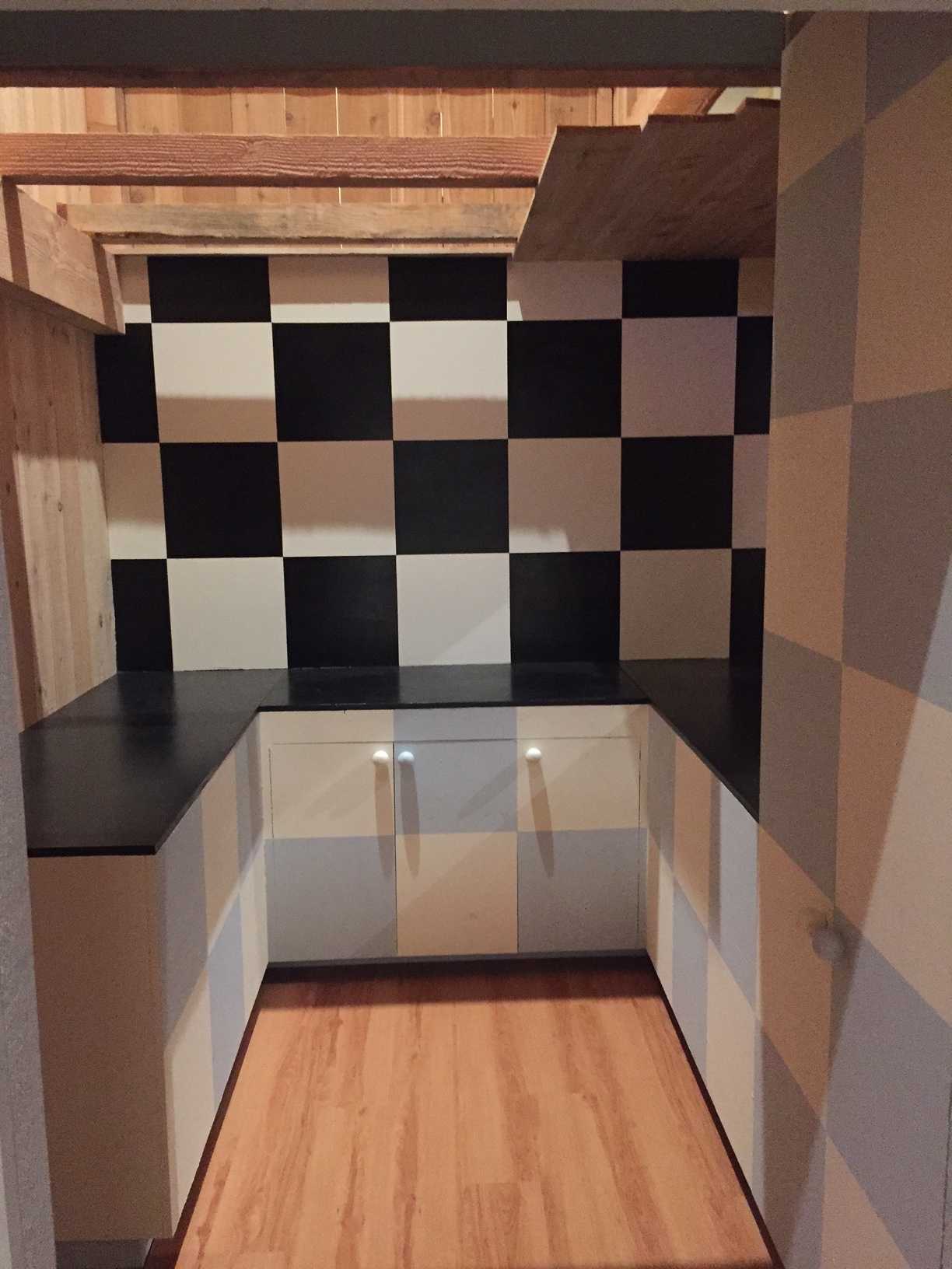
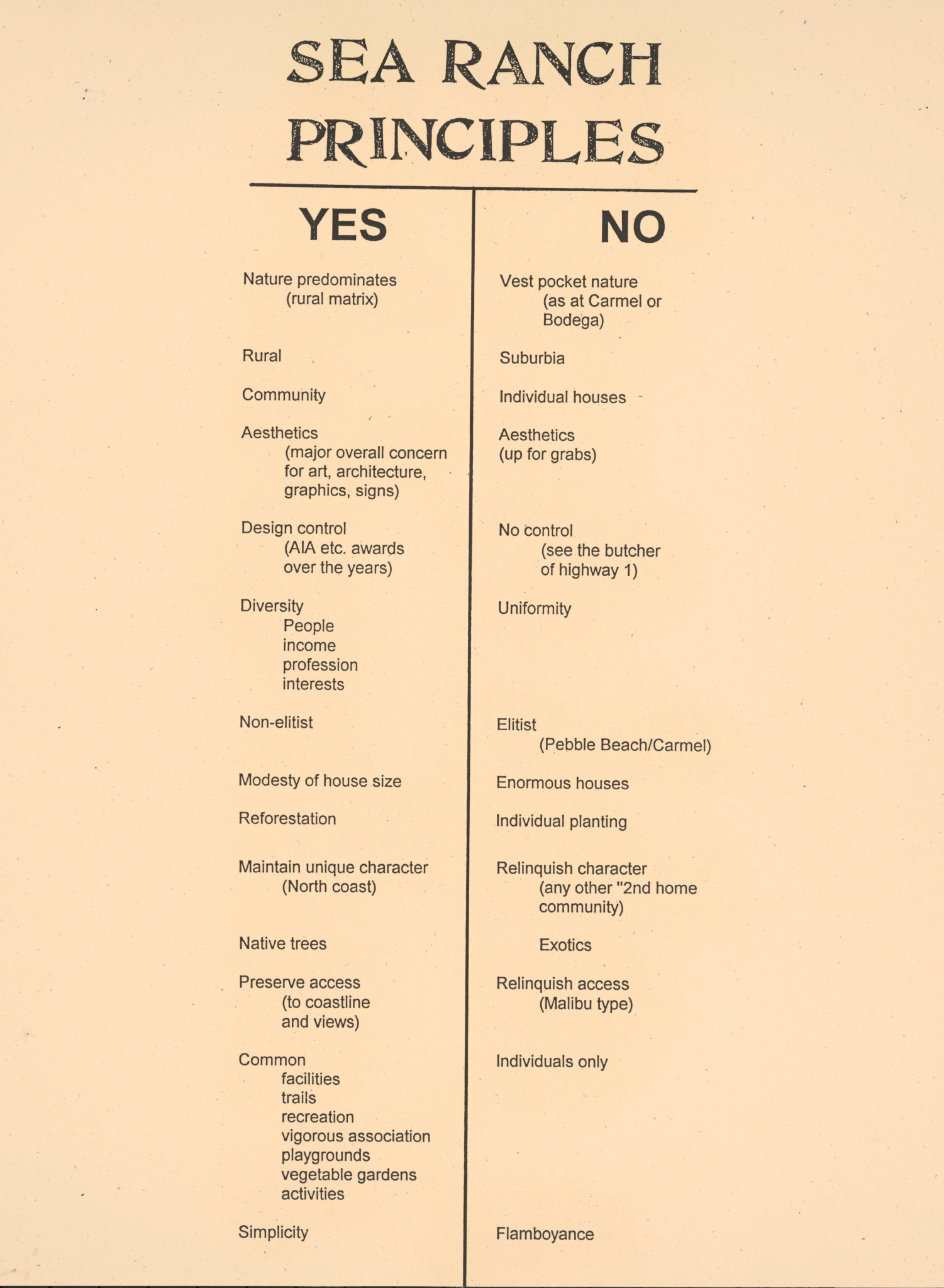
SF MoMA has built out the interior of a house within the exhibition gallery and it is under the weathered eaves you can catch a short film about the project with original participant interviews. As in Gibellina, Sicily, visionary but dogmatic planners were eager to influence the way we live our lives—see the list of dos and don’ts in my slide show (above). They were intent on making the development nature-and-environmentally friendly, yet ignored certain human foibles. The sixties and seventies were marked by this kind of futuristic ideation at a time when it felt like the world was indeed falling apart. Structure and planned community became a literal metaphor for trying to put back some kind of order into life.
The natural progression after seeing the show is the drive up to Sea Ranch where there are many vacation properties for rent and see what you think. Has it lived up to their prescription?
The importance of Kem Weber, Walt Disney's design guru
Dave Bossert, a 32 year veteran effects animator of the Walt Disney studio who worked on The Little Mermaid, Beauty and the Beast, Aladdin ,et al, was gifted the original Kem Weber-designed desk that had been his steady support and companion on his departure. His affection for this desk grew into a wonderful new monograph on Weber’s important design contributions to the Walt Disney studios in Burbank.
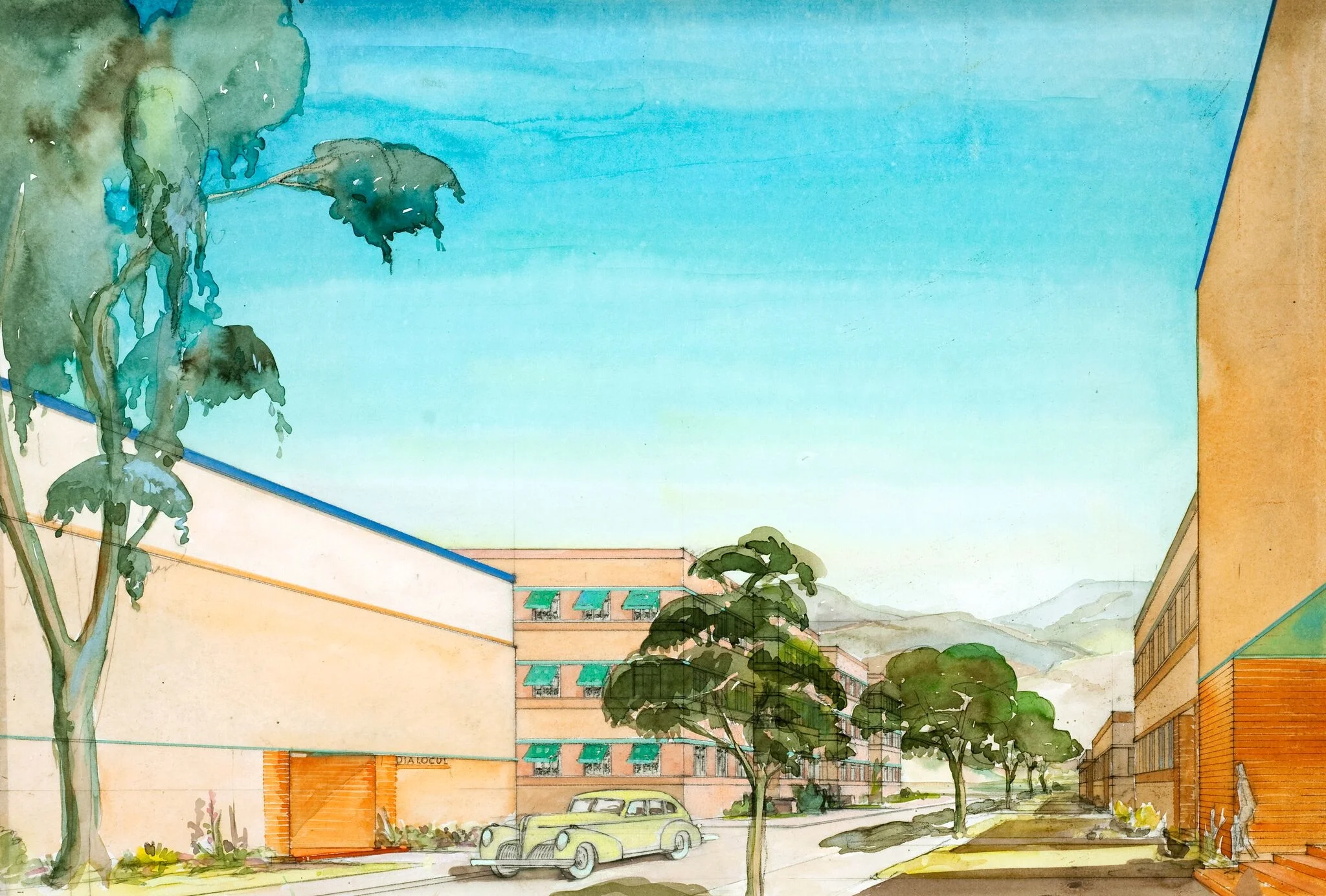
After the cozy mish mash of the Hyperion studios, Burbank was a streamlined factory. Workers complained that some of the spirit was gone, but in exchange they had the most efficient and beautiful machine from which to make their innovative and highly technical animated films.
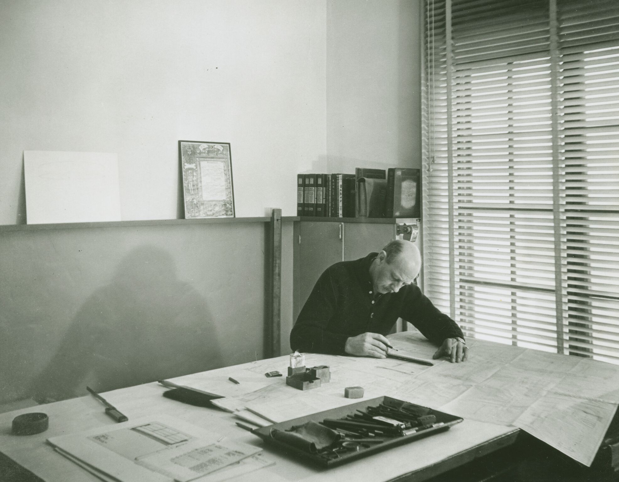
Bossert tracked down Weber’s original drawings and renderings for both the exterior physical plant and the custom furnishings at UC Santa Barbara. Each type of artist had a different desk: the flat, expansive kind for directors who had to lay out entire scenes or sequences, the tilt topped, back-lit kind for animators and assistants, the file cabinets, the shelving, the meticulously thought through workstation. Artist input was solicited for the preferred angle of light, the chair style, the comfort, the ease with which they could accomplish the maximum quantity of high-value, technical work.
Bossert was not there during the time period of my Vanity Fair story research on the Ink and Paint department which was the earlier Golden Age, but I know that the workers I interviewed very much appreciated this attention to their comfort and productivity and Bossert says in his era too, they all felt enduring capability and inspiration from their custom-designed surroundings.
Weber was German-born and had worked under a master of the Wiener Werkstatte as well as for the Barker Bros., but there is also much Bauhaus and International style as well as mid century modern in his influences. He found in Walt Disney a true patron who worked with him on almost every aspect of the studio design and who allowed him creativity as well.
Interestingly, Walt admired this kind of industrial design but not the worker collectivity theory behind it for almost as soon as they got to the new studio, the famous Disney strike began for which there was much retribution.
Weber desks have gone at auction for very high prices especially when they were attached to famous animators. I admire Weber’s work, even the smaller occasional pieces, and especially wish the commissary and the coffee shop still existed. Walt’s Weber-designed office is extant in the pink Animation Building, a testament to how innovative his thinking was on every aspect of the dynamic company he created.
Bossert’s beautiful book is for sale here.
Images courtesy of Dave Bossert, copyright UCSB.


